Uber versus Ola — App comparison
We all love these apps, we all use these everyday. We all have our favorite too. But despite the two apps solving for the same customer pain-point, the way they do it and the things they focus on seem to be very different. And that is reflected in the way their app flows are designed.

Here is my analysis and comparison of the two apps and features which I like/dislike in both:
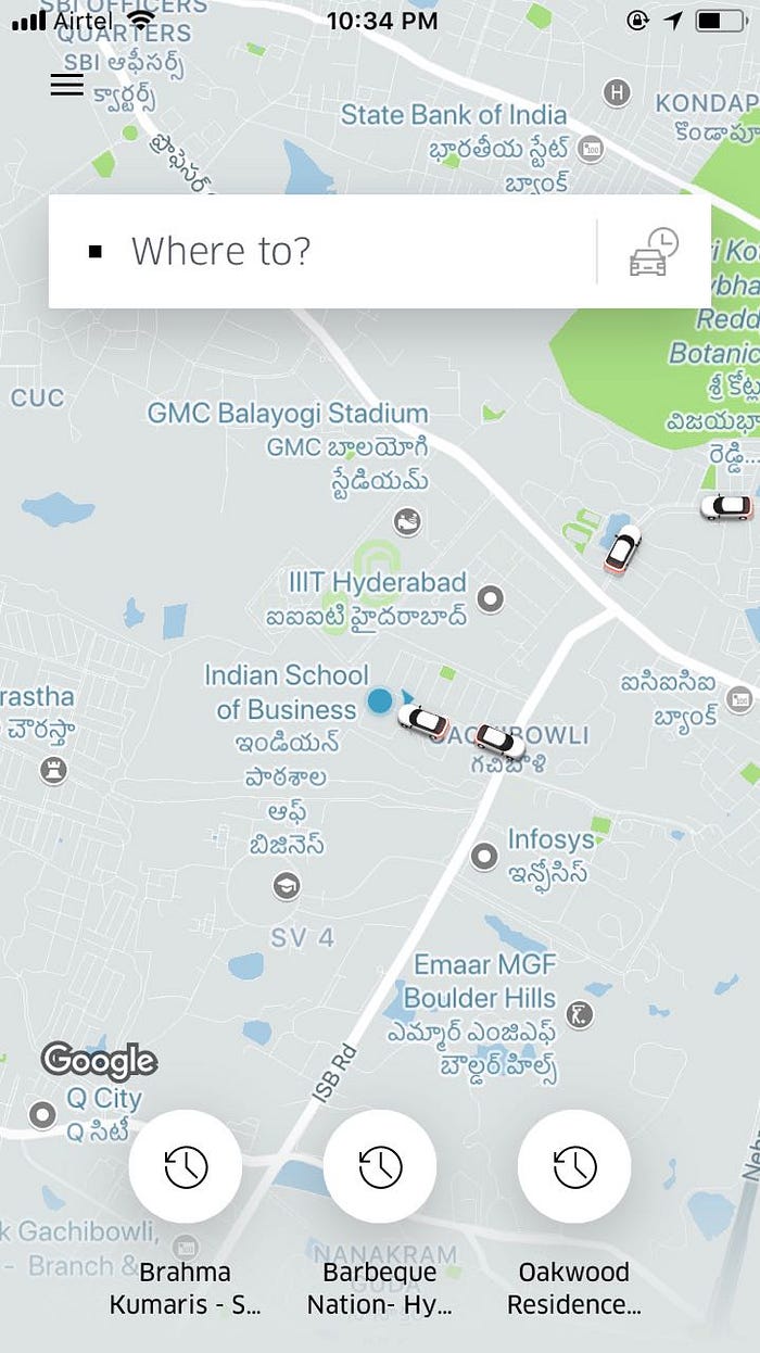
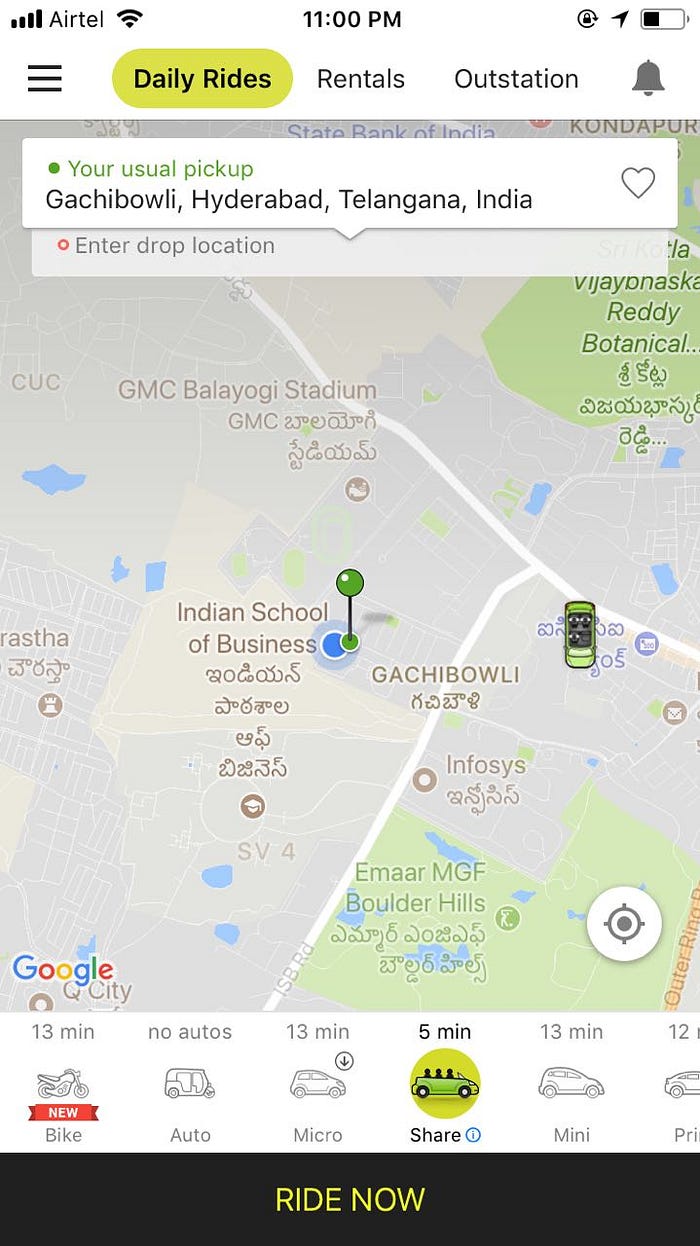
Clearly specifying the pick-up point — Ola’s ride booking explicitly shows the pick-up point, Uber implicitly assumes the pin accuracy and does not explicity show the same. I guess this comes from Uber being a global app and globally the accuracy of navigation not being a concern. Ola, on the other hand, knows Indian addresses can have issues and explicitly shows the pickup address.


Explicitly showing the different types of cabs available — Uber shows the type of options available only after the user has selected the drop point. Ola, on the other hand, shows the types of cabs available, along with their approximate time to reach the user on the home page. Today, this time that Ola shows may not be very accurate. But assuming it was, it does give a sense of the time trade-off very early on.
Explicitly comparing the cost of the different types of cabs available — Uber does a good job in showing the options with the price trade offs once the user has entered the destination. Ola only compares micro with share to nudge a customer to share or mini with prime to upsell. But the trade-off, say between a prime and share or share and auto does not come out clearly. A combination of cost versus time trade-off would be extremely useful to have — something neither of the two apps is best at.
Color of the car — Ola shows the color of the car which eases one’s search of the car, especially when booking from a heavy pick-up point. I know that Uber has this feature in other countries, not sure why they have not launched it in India. I read somewhere that Uber has data to say most cabs in India are white and hence not showing color should be fine. To my mind, this does not seem a good hypothesis to have, but Uber must have done its homework to explicitly remove this feature from India version.
Trip Detail Page — Why would a user visit a trip’s page after the trip has ended? Mostly for invoice, I guess. Or to rate the driver. Sometimes for support/reporting some issue. Ola shows the bill details upfront. Uber has the receipt a click away and gives more priority to support. In support too, the first option shown is ‘I was involved in an accident’. I am sure that is not there most common support query (I hope not). Ola shows the start and end time of the ride, which I feel is a useful information to show. I also like the way Ola uses colors subtly to show the start and end points, driver rating. Uber is all black and in that sense, takes more efforts for the reader to get the information.

OTP on Ola — OTP on Ola definitely adds more friction. But I feel it is again an India specific nuance, built from their learning of abuses. Even if Uber faces this, I am assuming, it will take some time to get it, given the worldwide app feature culture they are likely to have.
Share Features on Ola — Ola does a better job with promoting pool option. Be it the share pass to lock users or showing one’s relative pick-up and drop with respect to the other riders makes a person better prepared when in a share cab. In Uber, I mostly end up asking my driver whose drop is it first. When I want to book a share cab, I generally prefer Ola just for this reason.
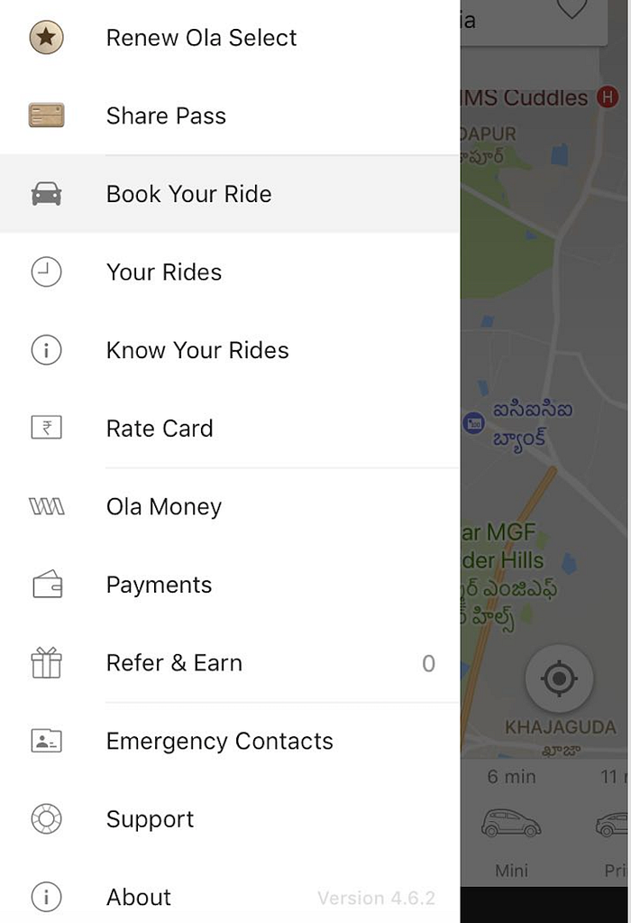
Complicated hamburger menu for Ola — Ola’s menu has so many options which seem overlapping to me. For example, why can’t Ola money be a part of payments? Why do ‘Rate Card’ and ‘Know your rides’ have to be separate? I like Uber’s simple menu, along with showing the user rating upfront.

Loyalty Features — Ola’s select program, ola money,ola play are value-add features which drive loyalty towards Ola. I have lately taken a few ola outstation rides as well and found the booking experience to be very transparent and assuring especially when in a new city.
Uber’s Know your driver’ program — The ‘Know your driver’ program in Uber seems to be a good engagement strategy, but an overkill. Given someone’s attention span, driver rating is enough to decide if one wants to ride with/depend on a certain driver. But given again that Uber is a global app and based on my US travel experience, people actually use this feature heavily abroad and in fact, this becomes one of the most important conversation starter between a rider and a driver. Only that in India, our culture is different. None of us gets into a cab and sees a great conversation with the driver as a way to have a good ride. We love to be with ourselves, on our phones, sleep, work. Talking to the driver is never on our list.
Overall, my vote from a PM’s perspective goes to Ola. Though there are some features, which I miss in both the apps especially around reconciliation of my bills when I need to submit them for reimbursements, monthly invoice downloads, masking my number from the driver and vice versa, optionally opting into pool if it does not impact my time of arrival and some more. Hopefully, I will write a separate article on some of these..
Are you an Ola or uber fan? Do you agree with my analysis or have some points to add here? What features you love best in each of these? What can they add? Would love to hear from you folks if you liked the article and would like to see more of these from me.
If you are interested in knowing how Uber designs, here is a link of a friend’s blog when he attended an Uber design event: https://medium.com/@Nambidextrous/10-things-i-learnt-about-uber-from-the-uber-bangalore-design-event-f5c0ee0fc775
